
2023

Roles
This is a project where I assumed the following roles:
User Experience (UX) Designer
User Interface (UI) Designer
Interaction (IxD) Designer
Deliverables
UX/UI Design:
Analysis of data
Stakeholder interviews
Information Architecture
Low fidelity wireframes
High fidelity prototype
Usability tests and findings
Project Specifications
Overview
Curriculum Engine is a powerful education app specifically designed for US district schools, offering tailored programs for states such as Georgia, California, Florida, North Carolina, and Texas. With its state-specific customization, including the Common Core State Standards (CCSS), this app ensures seamless course management and effective planning. Teachers can easily navigate and customize course materials to align with their school's curriculum standards, whether it's the CCSS or other state-specific requirements. By providing a comprehensive solution that incorporates the CCSS and state-specific standards, Curriculum Engine empowers teachers to deliver high-quality education that meets the rigorous standards set at both the national and state levels.
Problems
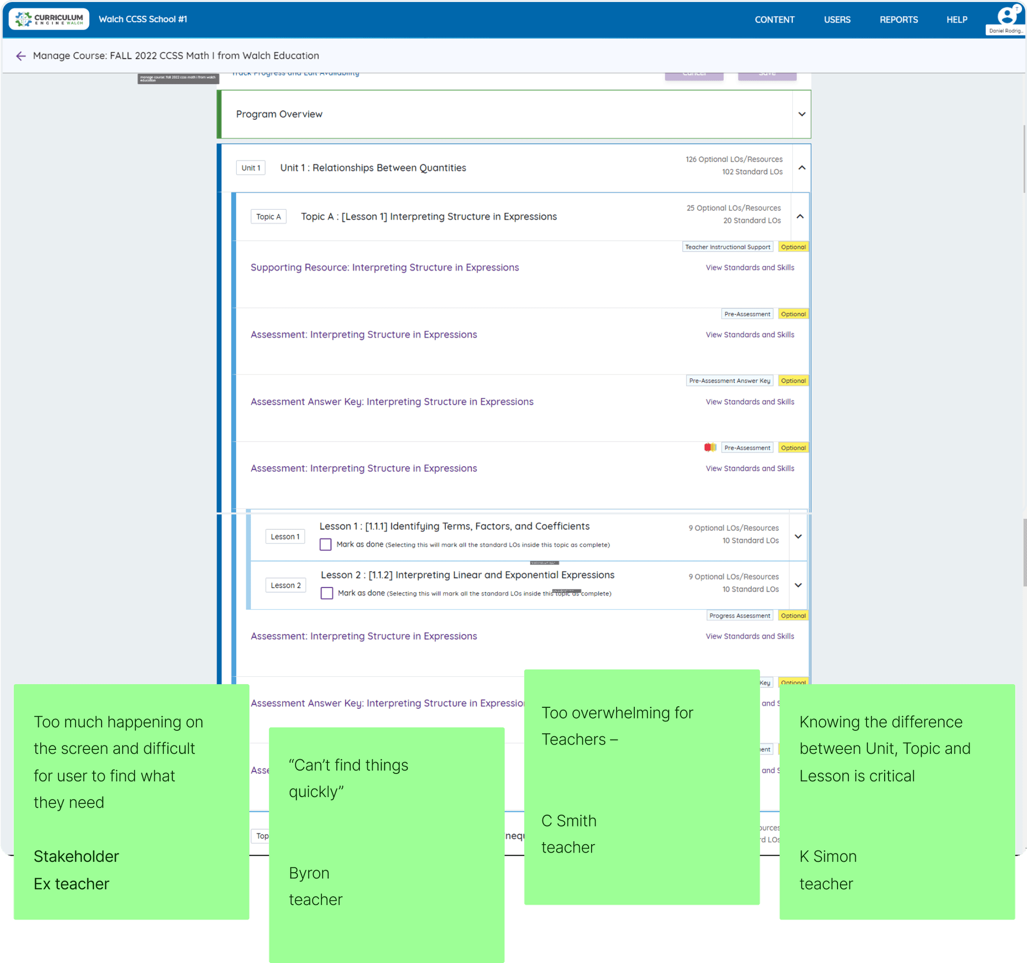
Teachers had navigational challenges and confusion while using the app, leading to inefficiency in their workflow
Users were facing difficulty in locating and identifying previously modified content, resulting in a lack of visibility and awareness of the changes made. ( No hierarchy)
Research suggested 45% of users are spending more than 5 hours a week curating their educational resources in general
Proposed Solutions
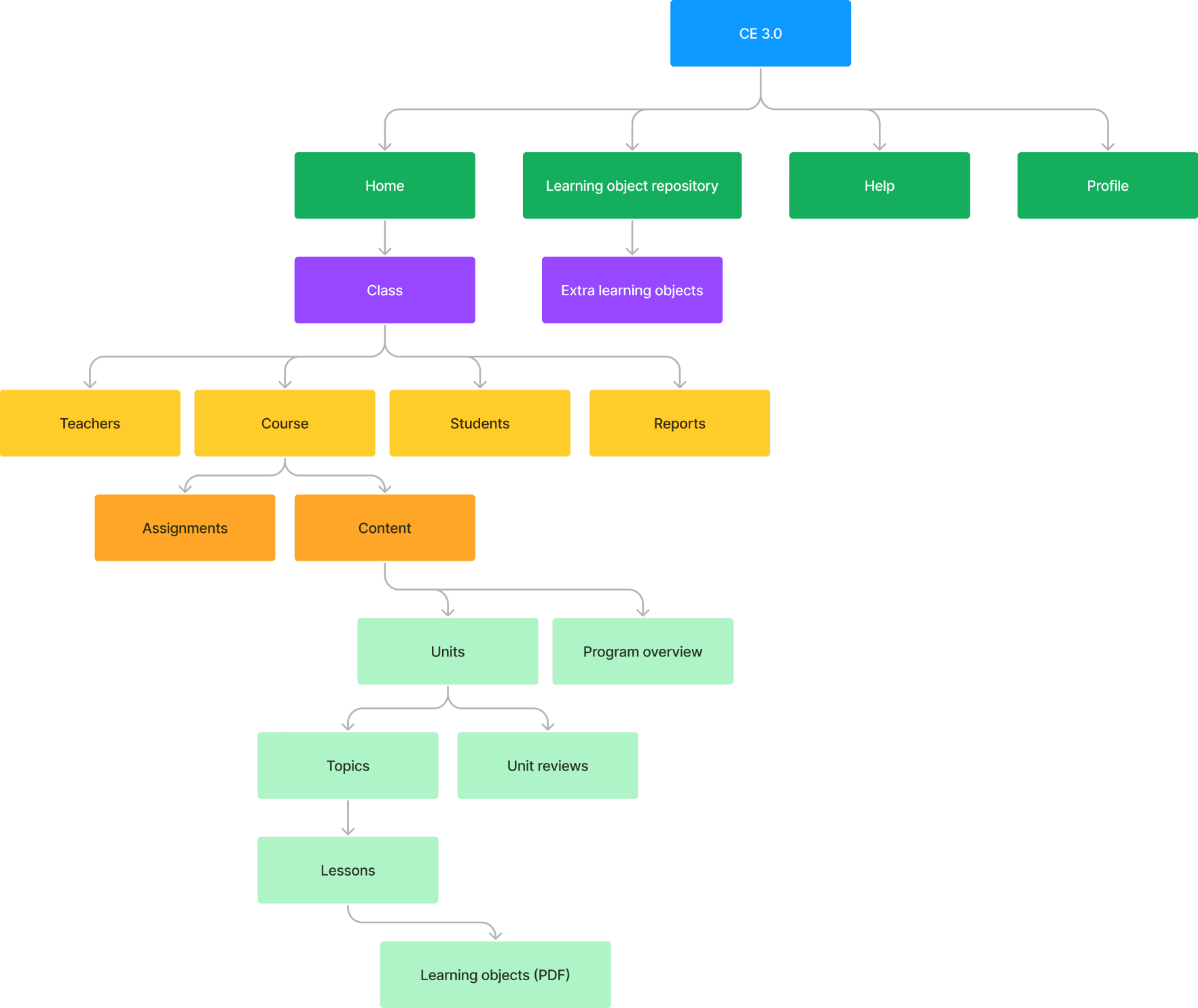
Establishing a clear hierarchy within the system
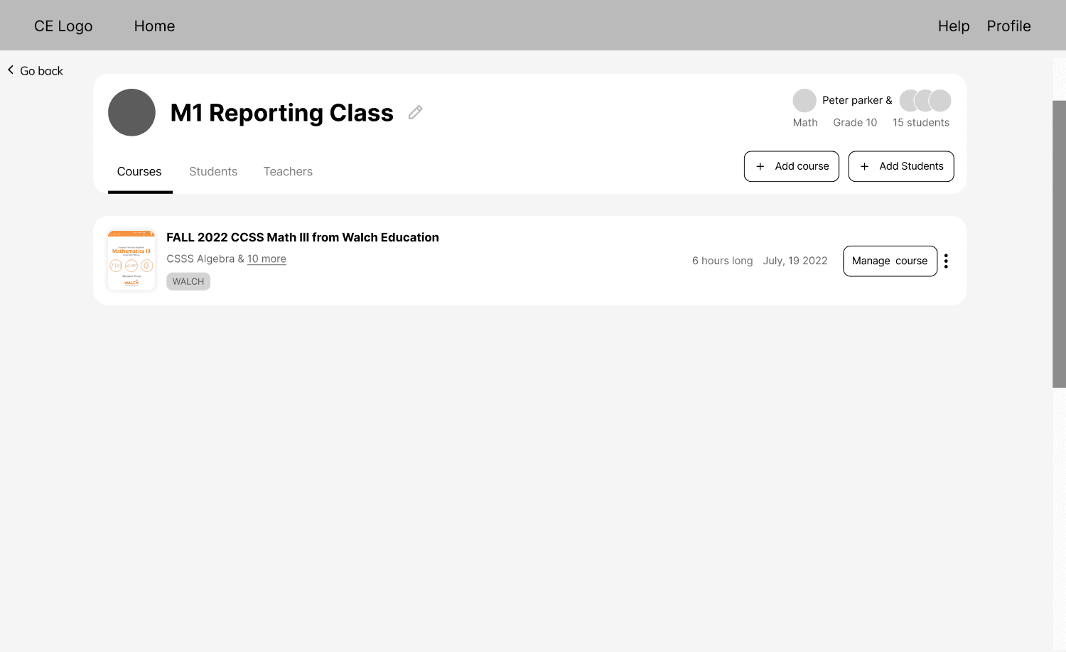
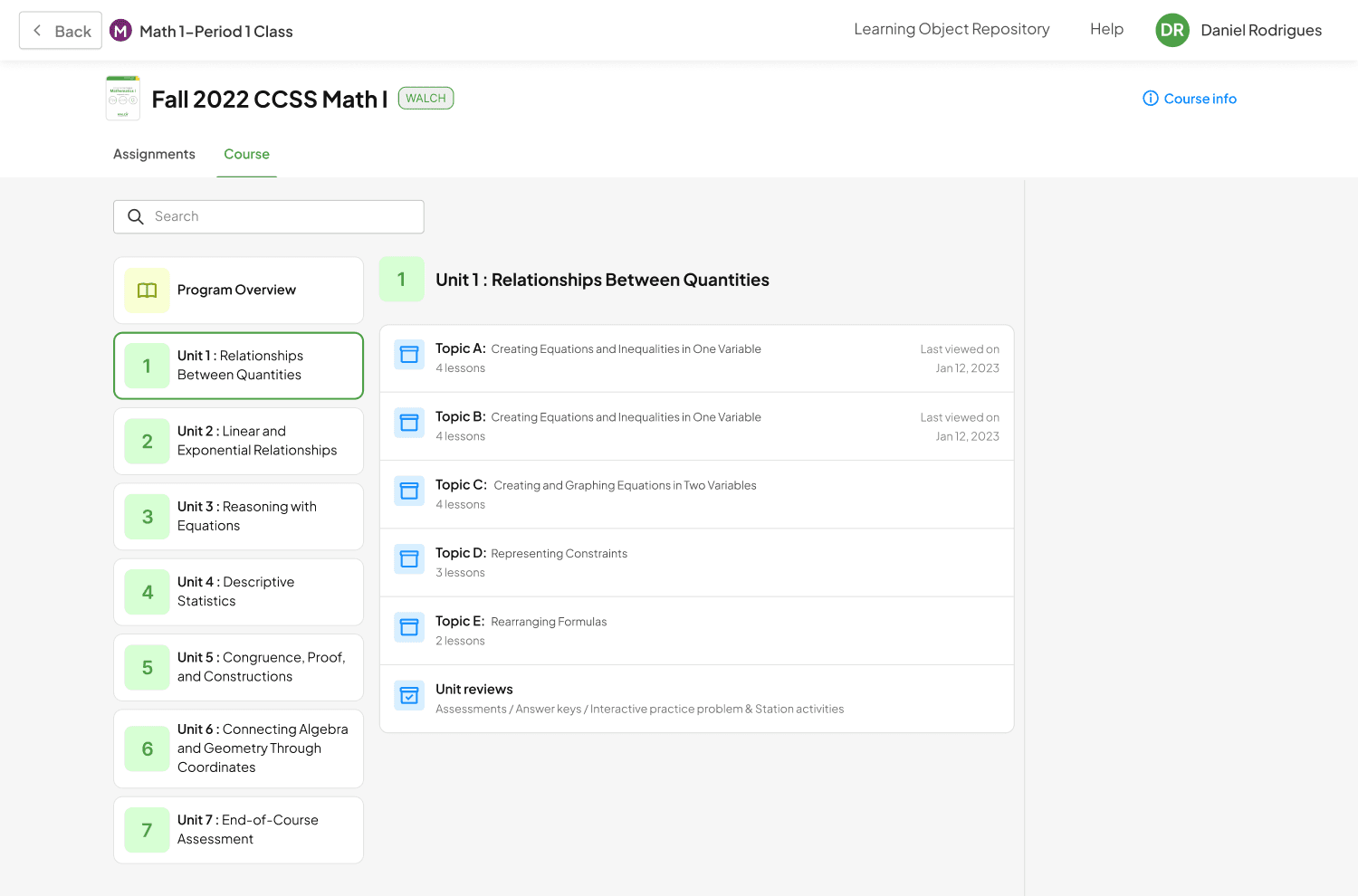
Organize items based on their relevance and ensure that Topics, Units, and Lessons were easily recognizable for users.
Avoid complex screens to reduce cognitive load and increase user satisfaction
Fewer options to see and focusing on what’s needed
Keep users informed about the progress and status of different tasks
Customer feedback
Due to an overwhelming amount of negative feedback at BW Walch, it became crucial to devise a new solution that would address the issues and improve the overall user experience.
Research
Based on extensive data research, in-depth analysis of user feedback, and insightful interviews with teachers, I gained a comprehensive understanding of the challenges we were facing on the platform. These invaluable insights empowered me to take on the role of a problem solver and develop a new and improved structure that addressed the pain points and provided a more user-friendly experience for teachers. As a result, the Curriculum Engine underwent a transformation that met the needs and expectations of our valued users.
Findings
Users were looking for lesson plan option
Weekly lesson planning is a common practice among educators
Teachers expressed a desire for increased autonomy in assigning lessons
Creating the structure
After conducting stakeholder interviews with teachers during the wireframing phase, an innovative idea emerged. This idea centered around empowering teachers with greater control over the app, enabling them to effortlessly deliver learning objects and exercise full autonomy in lesson planning. This approach grants teachers the flexibility to decide which learning objects to utilize and when to incorporate them, ultimately enhancing the overall user experience.
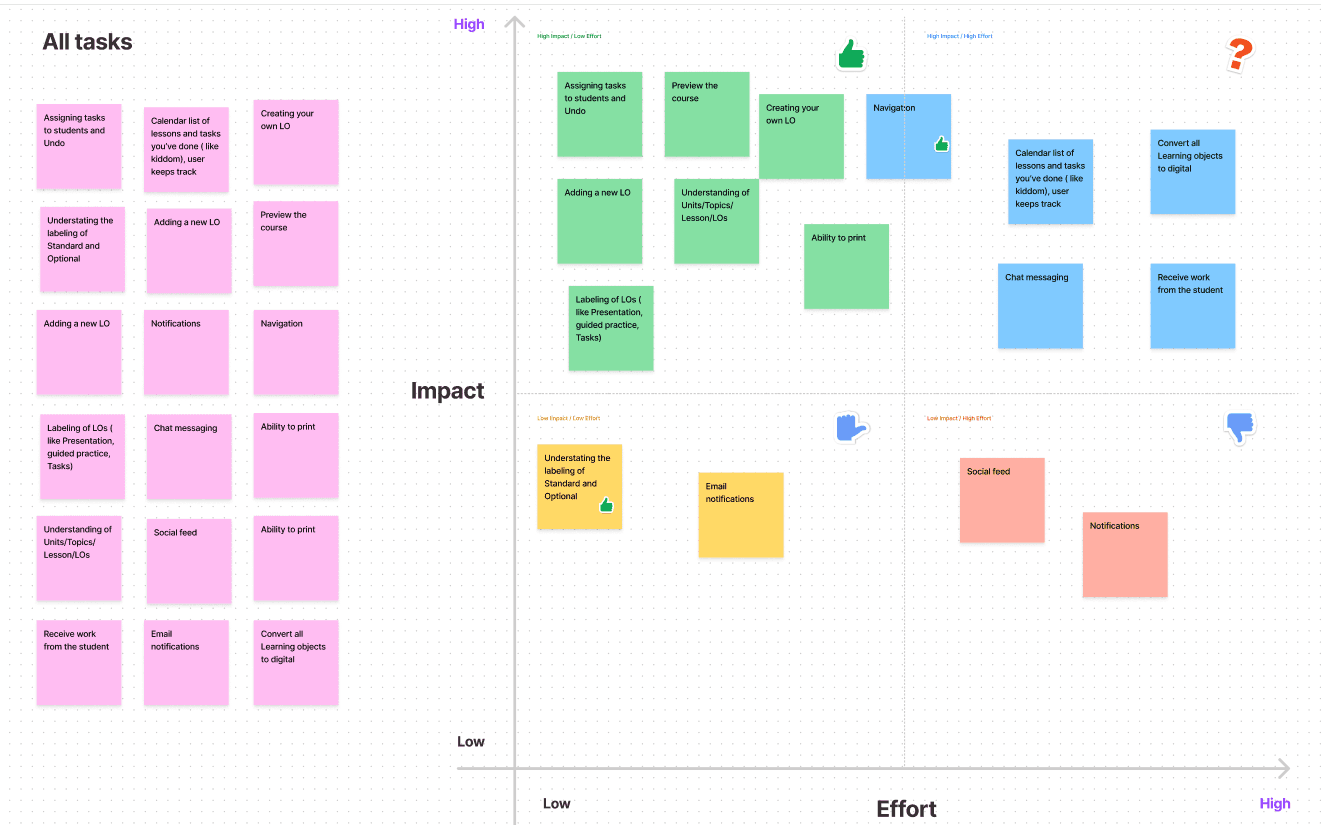
Task prioritization
Through a concise and impactful 15-minute Impact- Effort Plan, we conducted a task prioritization call with key stakeholders. This collaborative session allowed us to align our efforts with the business goals and begin generating solutions that would have the greatest impact. By leveraging this efficient planning approach, we ensured that our actions were purposeful, targeted, and aimed at achieving meaningful outcomes.
Wireframing
After thoroughly considering the concerns raised by teachers, stakeholders, and analyzing all app usage data, we started to define key insights. Our objective was to create an app that closely emulates real-life experiences, maximizing its authenticity. So in order to achieve this, our immediate focus was on establishing an improved suitable information architecture. By adopting a structure where classes mirror real-life courses, we ensure a seamless and intuitive user experience, facilitating users' navigation and engagement.


Final Designs
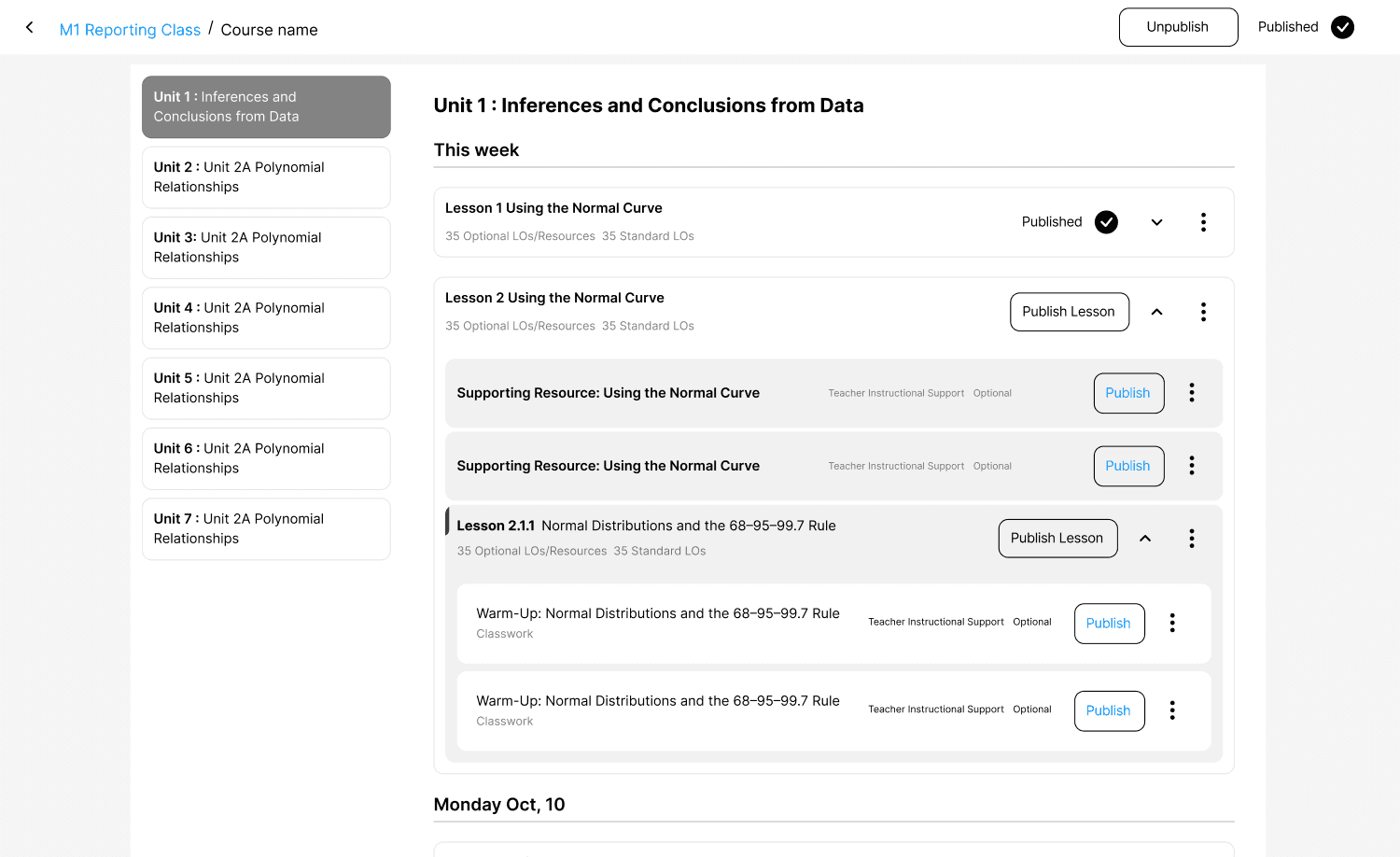
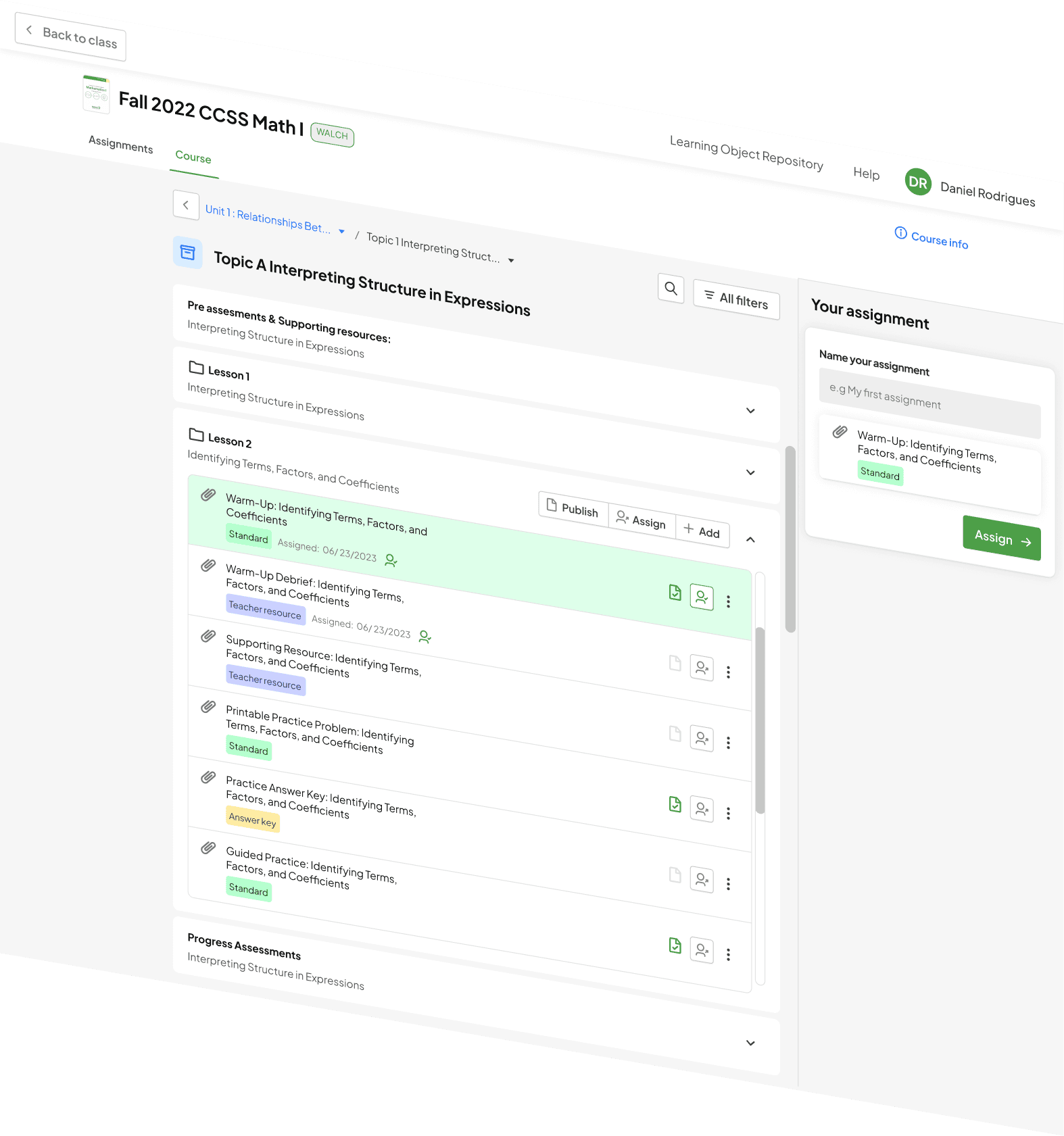
After some prototyping testing and enriched meetings with stakeholders and teachers, we found we had to step back a little in order to move on the right path. At this step we simplified a little more the UX structure of the app, having as a result that the “Assignments” were the main part of the app, and the course would be as the workbook.
In other words it became a 2 tab model, were the assignments would be the place were the teacher send out activities to students, for the course tab we ended up creating the same approach as the wireframes made before were the teacher can see the workbook and create assignments to be published on the assignments tab.


Explore protoype
Results
Based on usability testing conducted with a group of teachers from Florida and Georgia (5 participants), we successfully improved the task completion for the identified problem of managing the course
Navigation
Was reduced from 8 clicks to 4 clicks. Going from class to a learning object
-50%
Creating an assigment
Was reduced from 5 clicks if user didn’t get lost to only 2 clicks
-40%
Users didn’t get lost
Users completed our tasks of navigation to a learning object and also the creation of the assignment
5/5